The ReBranding Process of TreeHouse Craft Beer
by imaginesarah
 Who and Where?
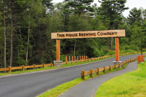
TreeHouse Brewing Company started in a red barn near the Pioneer Valley in Monson, Massachusetts. Their business was expanding and they became a household name in the New England area. Shortly after, they moved their retail shop to Charlton, Massachusetts to keep up the high demand for craft beer.
Challenges Of The Old TreeHouse:
The biggest challenge was how I could connect the name tree house to craft beer. When people think of tree house, they think about something from their childhood. My goal was to fit the company name to their personality and relate it to craft beer.
Another challenge was coming up with a value proposition for the brand. My goal was to set my brewery apart from the rest of the other breweries in New England. It took me many tries to come up with the perfect value proposition and I needed to figure out the key selling points about the brewery.
Research
Who goes to TreeHouse?
At first, my target audience was millennials and my goal was why they should choose Tree House beers. Later on, I expanded my target audience to people who enjoy hand on activities and the outdoors.
Limitations & Affordances of TreeHouse
- No Value Proposition
- Little SEO
Affordances
- Creating a value proposition that relates to the personality of the company.
- Creating new hashtags that will improve the company.
The Rebranding Process
Logo
Packaging Besign
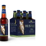
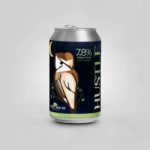
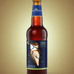
The new packaging design was also included in the rebranding project. This design is a huge improvement from the old packaging design and is more appealing and is heavily decorated because of its imagery. The information on the product was still important as the decoration because this information will persuade the consumer to buy this product.
The Three Important Parts of Information about the Product
- The Flavor
- The Logo
- The percentage of the content
Value Proposition
The Value Proposition was to express the idea of wisdom and knowledge. Treehouse is a brewery that uses an old fashion technique to brew their beers and don’t believe that new high-end technology for brewing beer is the best way to go. Their knowledge comes from years of research about brewing beers. The wisdom comes from the years of mastering the technique of crafting beer.
SEO
Treehouse had social media accounts, but was lacking keywords for their SEO. I took the time to come up with hashtags and keywords to help improve their SEO on their social media accounts and grow their business.
Ex:
#wisdom&knowledge
My Final Thoughts on The Process
The rebranding process of TreeHouse Brewing Company was a challenge, but a great learning experience. The process of rebranding and creating a whole new package design is a lot of work, but the final result can be worth it.
The Rebranding Story of Imagine Sarah
by imaginesarah
Branding is important for any company or business and we use it to introduce our services to the world. Somewhere down the line, we may realize that we want to make changes to our brands. We get tired of the way our logos look or simply want to make minor adjustments to our brands.
Out with The Old Logo and With in The New Logo
I started branding myself towards the end of my associate’s degree at New England Tech. The logo was the first and last initials of my name. The colors I used in my logo was a dark blue and light purple. Many people thought that the B in my logo represented my glasses and I went along with this idea for the time being.
The Design Process
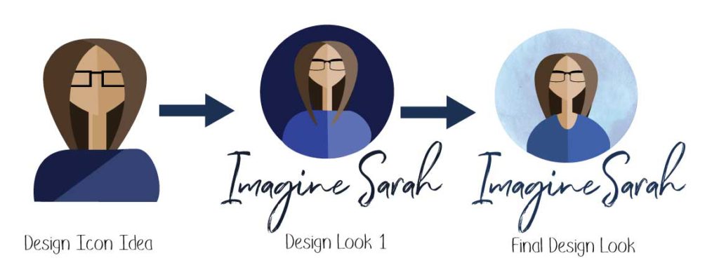
While earning my bachelor’s degree, I realized that my logo didn’t fit my brand identity anymore because I was growing as a designer and a person. My brand name is Imagine Sarah and I wanted my new logo to match my brand name. I had a hard time coming up with a design because I didn’t know how I wanted my logo to look. However, I am thankful for my professors and peers because their advice encouraged me to work harder in order to create a new logo.
I wanted my new logo to represent more of my identity than my original logo did. I still kept the glasses idea, but used them as an object in the design instead of as a letter. The reason why I chose an icon of myself because I wanted to illustrate what I looked like and used this idea as an example of my identity. I wanted my logo to have different colors of blue because blue is my favorite color and I feel this color fits my personality. The font I chose was called Soak Up The Sun and was created by 50Fox Studio. The reason why I chose this font was that I wanted a script font that looks like it was handwritten. Overall, I am happy with the final look of my new logo and the way it matches my brand identity.
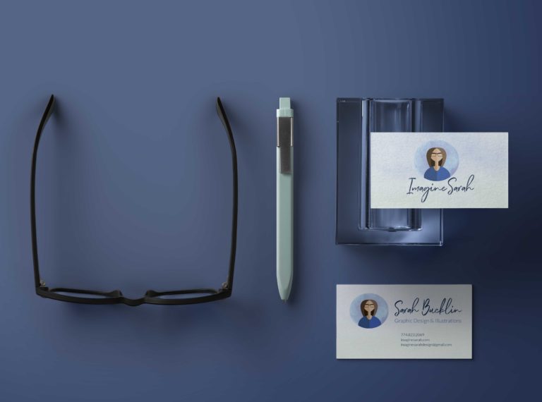
Mock Up Examples
Let's Talk
Are you having trouble with your brand or feel like your brand needs a redesign? Well, I will be glad to help you and discuss new ideas to improve your brand.

