State Posters
Chose the Four States
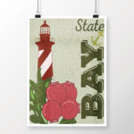
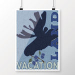
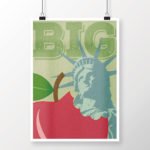
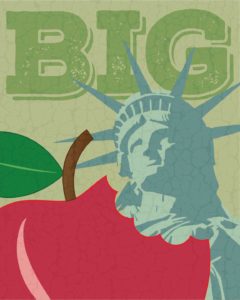
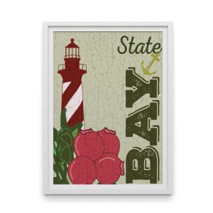
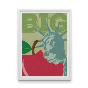
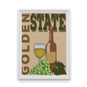
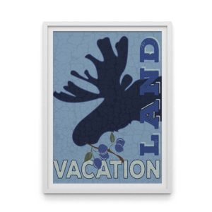
For our Illustrator class, I had to choose four states and designed posters from what I have learned in Adobe Illustrator. The catch was that I couldn’t say the name of our states within the posters and make them repeatable to each other. I choose fruit because I wanted to do something unique and I thought it would be fun to do.
The Four States
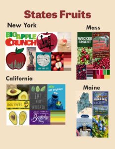
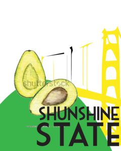
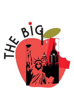
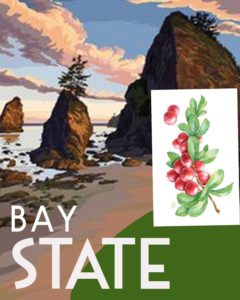
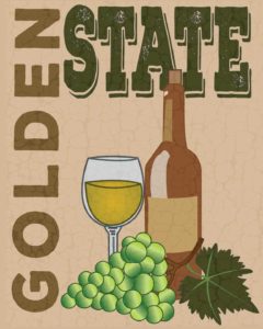
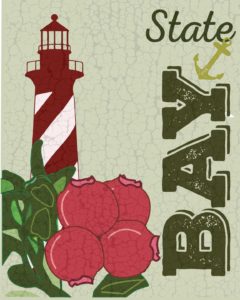
The states that I chose for poster were Maine, Massachusetts, New York, and California. Maine was the blueberry they are state because are the state fruit and are well known there. Massachusetts is the land of cranberry because it is the state fruit and popular fruit of Thanksgiving. New York was the big apple because it’s the city nickname. California was avocado, but it was changed to grapes because it was the golden state and wine country.
Brainstorming and Mood
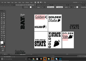
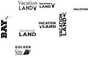
The next step was to use Pinterest and create a mood board for imagines that related to ideas. My focus was on finding simple shapes of the fruit and the other objects. Also, find types of typefaces to used for the poster’s designed. The Idea was to collect content that helped me figure out the design layout for each poster.
Type Faces
Photoshop
Putting the designs in Photoshop made my ideas strong because I could get a clear understanding of what I wanted to do. Playing around in Photoshop, I focused more on the graphics and typography without worrying about color. I had the chance to mess around with texture for the posters. Photoshop gave me ideas of what I wanted to do before going into Illustrator.
Illustrator
The Final Step of The Posters
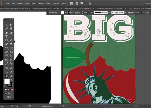
I used the pen in Illustrator and chances graphics with the tool. The process was very long because each graphic needed to traced by hand and look like organic shapes. Also, I used the shape tool to help me to outline some of the graphics as well. I added to color and texture to give them a better look.
Final Product
Need Some Help With Illustrations?
I can help you and together we can create something awesome.

